TL;DR:
- Conduct data-driven website audits focusing on bounce and conversion rates to identify issues.
- Design for real users by addressing errors, interruptions, and mobile responsiveness, not just the ideal path.
- Prioritize local context in Dubai, including multilingual support and cultural trust signals, for better results.
Your website has roughly 50 milliseconds to make a first impression before a visitor decides to stay or leave. For Dubai SMBs competing in one of the world’s most dynamic markets, a confusing layout or sluggish page can quietly drain your revenue every single day. Poor navigation, unclear calls-to-action, and cluttered screens are not just aesthetic problems. They are conversion killers. This guide walks you through a practical, step-by-step approach to auditing your site, fixing friction points, upgrading your visuals, and measuring real results so your website starts working as hard as you do.
Table of Contents
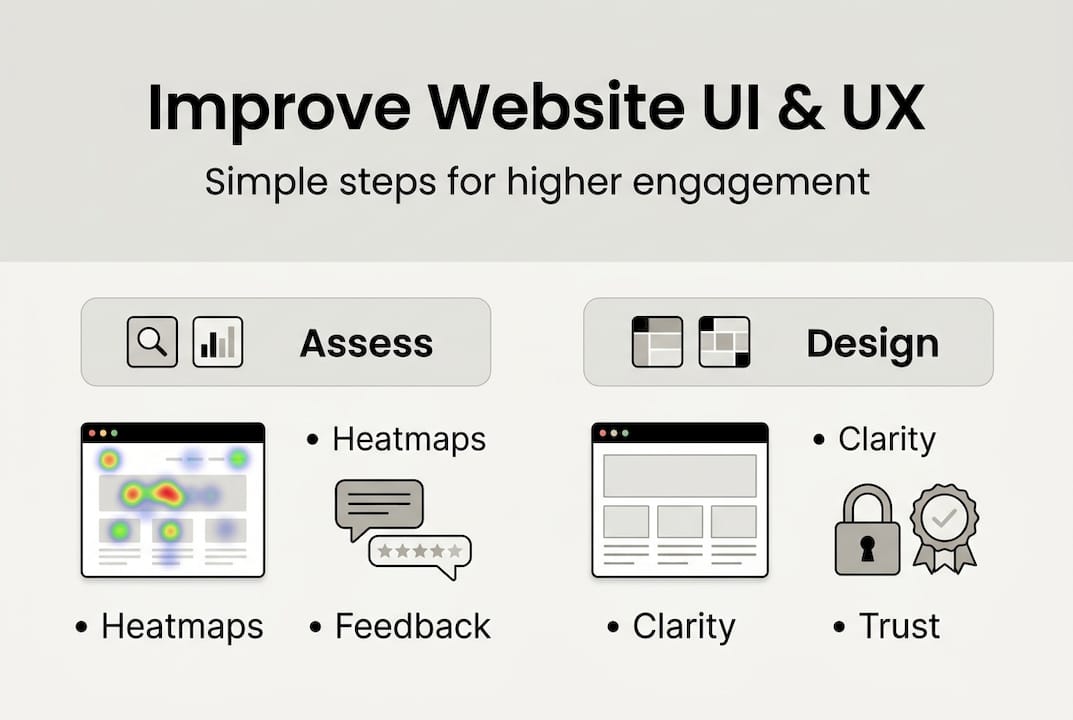
- Assess your current website: Where are users struggling?
- Design for real users, not just the ‘ideal journey’
- Upgrade the visual design for clarity and trust
- Test, iterate, and measure: Make data your guide
- Why most UI/UX advice misses Dubai’s unique business needs
- Take the next step: Expert help for your UI/UX journey
- Frequently asked questions
Key Takeaways
| Point | Details |
|---|---|
| Audit your website | Identify where users drop off by tracking bounce and conversion rates. |
| Prioritize real user needs | Design solutions for common errors, interruptions, and mobile shoppers. |
| Upgrade visuals strategically | Simple layouts and consistent branding quickly build trust and drive action. |
| Test and iterate continuously | Ongoing small changes based on analytics data yield steady improvement. |
| Localize for Dubai | Adapt design and UX for Dubai’s diverse, mobile-focused business audience. |
Assess your current website: Where are users struggling?
Before you fix anything, you need to know what is actually broken. Most business owners guess at their website’s problems, but guessing wastes time and money. The smarter move is to let data tell the story.
Start with your bounce rate. This is the percentage of visitors who land on a page and leave without clicking anything else. A high bounce rate often signals that users are not finding what they expected. Pair that with your conversion rate, which tracks how many visitors complete a desired action like filling out a contact form or making a purchase. Together, these two numbers paint a clear picture of where your site is underperforming.
Heatmaps take this further. Tools like Hotjar or Microsoft Clarity show you exactly where users click, scroll, and stop. You might discover that visitors never scroll past your homepage hero image, or that they repeatedly click on something that is not actually a link. These insights are gold. UX data shows that the average bounce rate sits around 56%, and A/B testing headlines alone can produce a 34% improvement in engagement.
Collecting user feedback is equally important. A short, three-question survey embedded on your site or sent via email can reveal frustrations that analytics miss. Check your customer support logs too. If the same questions keep coming up, your website is probably not answering them clearly.
A simple UX audit does not require a specialist. Walk through your site as a first-time visitor. Try to complete a key task, like booking a service or finding your pricing. Note every moment of confusion. For a structured approach, explore these UI/UX tips for Dubai businesses and use a UX audit checklist to stay thorough.
| UI/UX issue | How to detect it |
|---|---|
| Slow page load | Google PageSpeed Insights score |
| Unclear call-to-action | Heatmap click data |
| Cluttered layout | User session recordings |
| Broken links or 404 errors | Google Search Console |
| Poor mobile experience | Mobile usability report |
- Check bounce rate by page, not just site-wide
- Review heatmaps for your top 5 most visited pages
- Survey recent customers about their biggest frustrations
- Audit your navigation menu for clarity and depth
Pro Tip: Prioritize your homepage and your top service or product pages first. These pages carry the most traffic and fixing them delivers the fastest results.
Design for real users, not just the ‘ideal journey’
Most websites are designed around the happy path: the user arrives, finds exactly what they need, and converts. But real visitors do not always follow that script. They mistype forms, forget passwords, land on broken pages, and browse on slow connections during their commute. Designing only for the ideal journey means you are ignoring the majority of actual user experiences.
This is where edge-case-first design changes everything. Exception-first design reduces resolution time by 28 to 62%, because users who hit obstacles get clear guidance instead of dead ends.
“Interruptions, errors, and returns are not edge cases. They are the main journey.”
Think about the most common friction points your users face. A customer who enters an invalid phone number in your contact form should get a clear, friendly error message, not a generic red outline. A visitor who lands on a deleted service page should see a helpful 404 page with navigation options, not a blank screen. Someone returning to a half-filled form should not have to start over.
| Traditional UX approach | Edge-case-first UX approach |
|---|---|
| Design for the ideal user flow | Design for errors, interruptions, and returns |
| Generic error messages | Specific, actionable error guidance |
| 404 pages with no navigation | 404 pages with links to popular content |
| Forms that reset on error | Forms that preserve user input |
Here is a practical checklist to address the top three edge cases on any Dubai SMB website:
- Broken forms: Test every form submission with invalid data. Confirm that error messages are specific and appear next to the relevant field.
- 404 errors: Customize your 404 page with your logo, a search bar, and links to your main service pages.
- Slow connections: Compress images and enable lazy loading so pages remain usable on slower mobile networks.
For a deeper look at how these principles apply locally, review UI UX best practices and understand the distinct UI and UX roles that shape a resilient website.
Upgrade the visual design for clarity and trust
Once your page flows are solid, it is time to make your site look and feel credible. Visual design is not about decoration. It is about communicating trust in the first few seconds before a visitor reads a single word.

Start with typography. Choose one or two clean, readable fonts and use them consistently. Body text should sit at a minimum of 16px so it is comfortable to read on any device. Avoid decorative fonts for body copy. They slow reading and signal amateur design.
Color works the same way. A consistent color scheme tied to your brand builds recognition and professionalism. High contrast between text and background is not optional. It is a basic accessibility requirement that also makes your site easier to scan. The design thinking process starts with understanding how users perceive your brand before they read your content.
White space is one of the most underused tools in web design. Crowding elements together makes pages feel overwhelming and untrustworthy. Giving content room to breathe guides the eye naturally from one section to the next.
For trust signals, place your logo in the top left where users expect it. Add client testimonials near your key calls-to-action. If you have certifications or media mentions, display them prominently. These visual design tips can make a measurable difference in how long visitors stay and whether they convert.
UX investment data shows that every $1 spent on UX can return $2 to $100, and a 5% increase in retention can boost profits by 25 to 95%. That makes visual credibility one of the highest-leverage investments you can make.
Five visual UI best practices for conversion:
- Use a single, high-contrast CTA button color per page
- Align elements to a consistent grid for a structured, professional look
- Limit your homepage to three to five core messages
- Use real photos of your team or work instead of generic stock images
- Keep your header navigation to five items or fewer
Pro Tip: A/B test your CTA button color on your highest-traffic page. Even a single color change has been shown to lift click-through rates by double digits.
Test, iterate, and measure: Make data your guide
A website is never truly finished. The businesses that win online are the ones that treat their site as a living product, not a one-time project. With your visual upgrades in place, the next move is building a habit of continuous, data-driven improvement.
Set up Google Analytics 4 if you have not already. Configure conversion events for your most important actions: form submissions, phone clicks, and page visits that indicate purchase intent. Then watch your bounce rate by page. A page with a 75% bounce rate needs attention before anything else.
A/B testing sounds technical but it is straightforward in practice. You show half your visitors one version of a page and the other half a slightly different version. Change one element at a time: the headline, the CTA button text, or the number of form fields. Tested headlines produce a 34% engagement lift on average, and reducing a form by just one field can cut abandonment by 20%.
For improving engagement with design, periodic user testing is invaluable. Ask five real customers to complete a task on your site while you watch. You will spot friction in minutes that months of analytics might miss. To understand the broader UX impact on business growth, connect your UX changes directly to revenue metrics.
Four UI/UX changes to track over time:
- Bounce rate per key page, measured monthly
- Conversion rate for your primary lead form
- Average session duration as a proxy for engagement
- Mobile vs. desktop conversion gap
Stat to know: The average website bounce rate is 56%. If your homepage sits above that, you have a clear, measurable target to beat.
Small, consistent improvements compound fast. A 10% conversion rate lift this quarter and another next quarter adds up to transformative growth over a year.
Why most UI/UX advice misses Dubai’s unique business needs
Here is something most generic UI/UX guides will not tell you: the best practices written for Western markets do not always translate to Dubai. Your customers are multilingual. Many switch between Arabic and English mid-session. A significant portion browse exclusively on mobile, often on the go between meetings or during commutes. And Dubai’s market has a strong luxury expectation. Visitors judge quality fast, and a site that feels outdated signals that your business might be too.
We have worked with Dubai SMBs since 2004, and the pattern is consistent. A business applies a standard UX checklist, sees modest results, then wonders why. The answer is almost always cultural context. Trust signals in Dubai include Arabic language support, local phone numbers, and recognizable payment methods. Navigation patterns that work in the US feel unfamiliar here.
The smarter approach is to test your site across languages and device types before drawing conclusions. Run your A/B tests with your actual Dubai audience. Use UI/UX strategies for Dubai business that account for local behavior, not just global averages. When you design with your real customer in mind, the results come faster and stick longer.
Take the next step: Expert help for your UI/UX journey
Applying these improvements on your own is absolutely possible, and the steps above will get you moving. But if you want to accelerate results and avoid costly trial-and-error, working with specialists who understand both world-class UX and the Dubai market is the fastest path forward.
At DubaiWebCity, we have spent over 20 years helping Dubai SMBs build websites that convert. Whether you need creative web design ideas to refresh your brand, a fully responsive website design in Dubai that performs on every device, or a complete overhaul from our UI UX design agency, we are ready to help. Reach out today for a free consultation and let’s turn your website into your strongest sales tool.
Frequently asked questions
What’s the fastest way to improve my website’s user experience?
Start by analyzing your homepage and key pages for friction points, then simplify navigation and reduce unnecessary steps based on user feedback. Tracking bounce rates and heatmaps will show you exactly where visitors are dropping off.
How can I measure if my UI/UX improvements are working?
Use analytics to watch for lower bounce rates, higher conversions, and positive user survey results after each change. A/B tested headlines show a 34% lift and reducing form fields cuts abandonment by 20% per field removed.
Which common UI or UX mistakes hurt conversions most?
Complex forms, unclear navigation, and ignoring mobile users are the top conversion killers for Dubai SMB websites. Designing for edge cases like errors and interruptions is just as critical as optimizing the ideal user flow.
How much ROI can I expect from investing in UI/UX?
For every $1 invested in UX, you can expect $2 to $100 in return, with even a 5% retention bump delivering up to 95% more profit for your business.
Recommended
- UI/UX tips that boost Dubai SMB engagement in 2026
- UI and UX roles in web design: boost business growth
- Boost user engagement with effective web design in Dubai
- 6 Essential UI UX Best Practices for Dubai Web Designers
- Wyjaśnienie pojęcia UX w projektowaniu stron – przewodnik 2026 – Publikacje eksperckie dotyczące stron www i rozwiązań webowych