TL;DR:
- Dubai SMBs primarily serve mobile users, making mobile-first design essential for engagement.
- Designing for small screens first improves site performance, user experience, and search rankings.
- Continuous testing and updates are crucial for maintaining effective mobile-first websites in Dubai’s fast-changing market.
Most Dubai business owners assume their website looks fine on phones because it “technically works.” That assumption is costing them customers. Mobile traffic dominates online activity for businesses across Dubai, meaning the majority of your potential customers are landing on your site from a smartphone, not a laptop. Yet many local SMB sites were built with a desktop screen in mind first, and mobile was patched in afterward. This guide breaks down exactly what mobile-first design is, how it differs from what most businesses currently have, and what it can realistically do for your engagement, rankings, and revenue in Dubai’s competitive market.
Table of Contents
- What is mobile-first design? Explained simply
- Core principles and technical essentials of mobile-first design
- Why mobile-first matters for Dubai SMBs: Business impact and benchmarks
- How Dubai SMBs can implement and test mobile-first websites
- The mobile-first mindset: What experts wish Dubai SMBs understood
- Supercharge your Dubai business with mobile-first web design
- Frequently asked questions
Key Takeaways
| Point | Details |
|---|---|
| Mobile-first defined | Designing for mobile devices first ensures your site works seamlessly across all screens. |
| Business impact | Dubai SMBs gain higher engagement, lower bounce rates, and better search rankings. |
| Essential principles | Focus on content prioritization, touchability, navigation, and fast loading times. |
| Action steps | Start with a content audit, design for small screens, and always test on real mobile devices. |
What is mobile-first design? Explained simply
With the need established, let’s break down what mobile-first design actually means and why the shift matters.
Mobile-first design is exactly what it sounds like: you design for the smallest screen first, then work your way up to tablets and desktops. That’s the opposite of how most websites were built even five years ago. The older method, called desktop-first or “graceful degradation,” started with a full-featured desktop layout and then stripped things away for smaller screens. The problem? You end up cutting features and squeezing content instead of building something that actually fits how mobile users behave.
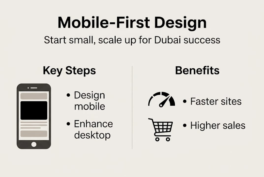
Mobile-first design starts from mobile and enhances toward desktop, not the reverse. This approach is called “progressive enhancement,” and it was pioneered by Luke Wroblewski, who argued that focusing on core user needs first produces cleaner, faster, and more focused digital experiences. When you design for a 375px wide screen before you design for a 1440px monitor, you’re forced to make hard choices about what truly matters to your user.
Here’s a simple comparison of the two approaches:
| Feature | Desktop-first | Mobile-first |
|---|---|---|
| Starting point | Large screen layout | Small screen layout |
| Approach | Remove features for mobile | Add features for desktop |
| Performance | Often slower on mobile | Optimized for speed |
| User focus | Desktop user assumed primary | Mobile user assumed primary |
| SEO alignment | Weaker for mobile indexing | Stronger for Google ranking |
“Designing for mobile first forces clarity. Every element on the screen must earn its place. That discipline produces better products across all screen sizes.”
For Dubai SMBs, this distinction is not academic. Your customers in Dubai are browsing Instagram, searching Google, and clicking your WhatsApp link all from their phones. If your site loads slowly or feels awkward on a 6-inch screen, they leave. Building for mobile web design engagement from the ground up means you’re meeting users where they actually are, not where they used to be.
Understanding the mobile-friendly advantages goes beyond just layout. It’s about designing with your Dubai customer’s context in mind: they may be in a mall, on a metro, or in a taxi. Their attention is split. A mobile-first site respects that reality and removes every possible friction point.
Core principles and technical essentials of mobile-first design
Now that the definition is clear, let’s look at what makes mobile-first design unique on the technical and user experience level.
Mobile-first is built on a handful of clear principles. The key methodologies include content prioritization, wireframing for small screens, visual hierarchy, touch-friendly elements, thumb-zone awareness, simple navigation, and CSS media queries. Each of these plays a direct role in whether your Dubai customers stay or leave.
Here’s a quick-reference table of technical benchmarks every mobile-first site should hit:
| Parameter | Recommended standard |
|---|---|
| Touch target size | Minimum 44×44 pixels |
| Page load time (mobile) | Under 3 seconds |
| Font size (body text) | Minimum 16px |
| Tap spacing between elements | At least 8px gap |
| Mobile viewport width | 320px to 480px starting point |
The thumb zone concept is worth pausing on. Most users hold their phones with one hand and operate the screen with their thumb. The center and lower portions of the screen are easy to reach. The top corners are hard. A mobile-first designer places your most important buttons (like “Call Us” or “Book Now”) in the natural thumb zone, not hidden in a top-right corner.
For SMBs ready to take action, here’s a practical starting checklist:
- Audit your content: List every element on your homepage. Cut anything that doesn’t serve the primary user goal.
- Wireframe for mobile first: Sketch layouts at 375px wide before touching larger screens.
- Use CSS media queries: Start with base mobile styles, then layer on rules for tablet and desktop breakpoints.
- Prioritize above-the-fold content: Mobile users decide within seconds. Your value proposition must be visible immediately.
- Simplify navigation: Use a hamburger menu or bottom navigation bar. Avoid complex dropdown menus.
Applying solid UI/UX tips for SMBs during this phase makes the difference between a site that looks mobile-friendly and one that genuinely performs. The responsive design benefits only materialize when the technical foundation is right.
Pro Tip: Always test on real devices, not just browser simulators. Borrow an Android and an iPhone if needed. The most popular smartphone models in Dubai include Samsung Galaxy and iPhone 15 series, so make sure your site feels natural on both.
Why mobile-first matters for Dubai SMBs: Business impact and benchmarks
Understanding the principles is key, but the big question for any Dubai SMB is: why does mobile-first design really matter for your bottom line?
The numbers are hard to ignore. Sites that take more than 3 seconds to load lose 53% of mobile visitors before a single page even renders. In a market like Dubai, where users expect instant access to everything from food delivery to financial services, that delay is a direct revenue loss. Every second your page lags is a customer leaning toward your competitor.

Beyond load times, mobile-first design directly affects your Google ranking. Since 2019, Google has used mobile-first indexing, meaning it evaluates and ranks your website based on its mobile version, not the desktop version. If your mobile site is slow, hard to read, or missing content, your search visibility suffers even if your desktop site looks perfect.
Here are the four most direct business gains from going mobile-first:
- Lower bounce rates: When mobile users find a site that’s easy to navigate, they stay longer. More time on site signals quality to both users and search engines.
- Higher conversion rates: Touch-friendly forms, visible call-to-action buttons, and fast checkout flows turn browsers into buyers.
- Better Core Web Vitals scores: Google measures Largest Contentful Paint, Cumulative Layout Shift, and Interaction to Next Paint. Mobile-first builds naturally score better on these.
- Stronger Google ranking: Mobile-first indexing means your mobile experience is your SEO reputation. Improve one, improve the other.
Mobile-first boosts engagement, lowers bounce rates, and drives higher conversions for Dubai businesses in ways that desktop-first designs simply cannot match. Understanding how UX drives growth for local SMBs makes it clear that this is not optional anymore. Partnering with a local web agency that understands Dubai’s specific market dynamics adds another layer of advantage.
Pro Tip: Run your current site through Google’s PageSpeed Insights tool on its mobile setting. If your score is below 70, you have a concrete problem to solve and a clear starting point.
How Dubai SMBs can implement and test mobile-first websites
Once you see the value, the next step is clear: here’s how any Dubai SMB can start building success with mobile-first design.
The process doesn’t have to be overwhelming. Start with a mobile content inventory, design for small screens first, use container queries and progressive enhancement, and validate with Core Web Vitals throughout. That’s the framework. Here’s how it breaks down practically:
- Audit your existing content: List every page element, image, form, and block of text. Rank each by importance to your user’s goal. Remove or move anything ranked low.
- Start small, literally: Design your homepage at 375px wide. If it doesn’t work there, it won’t work anywhere.
- Build up progressively: Once your mobile layout is solid, use CSS media queries to enhance the layout for tablets (768px) and desktops (1200px+).
- Use modern CSS tools: Container queries and flexible grid systems give you precise control without hard-coding pixel values.
- Test with Core Web Vitals: Use Google Search Console and PageSpeed Insights to track your scores throughout the build.
Mistakes to avoid as you implement:
- Treating mobile design as a resized version of desktop. It’s a completely different user context.
- Ignoring the thumb zone. Placing important buttons at the very top of a tall page guarantees poor usability.
- Skipping real-device testing. Simulators miss real-world performance issues like network speed and touch responsiveness.
- Using oversized images. A 4MB hero image will break your load time on any mobile network.
Working with professionals who specialize in UI/UX design support in Dubai means you skip the trial-and-error phase. If you want to boost SMB engagement from day one, experienced local designers can translate your brand into a mobile-first experience that performs.
The mobile-first mindset: What experts wish Dubai SMBs understood
All these practical steps are vital, but the real difference comes from embracing a true mobile-first mindset, and most businesses stop short of it.
Here’s what we see repeatedly in Dubai’s SMB market: businesses invest in a “responsive” website and consider the job done. Responsive design is a technical feature. Mobile-first is a decision-making philosophy. Responsive means your site adjusts to screen sizes. Mobile-first means you started from the smallest screen and built every decision around that user.
The uncomfortable truth is that you can have a responsive site that still performs terribly on mobile because the original thinking was desktop-centric. Navigation that was simplified after the fact, images that were scaled down but never optimized, content that was compressed but never re-prioritized. These are responsive sites. They are not mobile-first sites.
Dubai’s mobile landscape also changes faster than most markets. New devices, faster 5G rollout, shifting app behavior, all of it means your mobile experience needs continuous attention, not a one-time build. Real success requires testing on real devices with real Dubai users, gathering feedback, and updating regularly. Following UX trends in Dubai keeps you current rather than reactive. The SMBs winning in this market treat mobile experience as a living product, not a finished project.
Supercharge your Dubai business with mobile-first web design
If this guide has made one thing clear, it’s that mobile-first design is now a business requirement for any Dubai SMB that wants to compete online. Knowing what to do and having the expertise to build it correctly are two different things.
At DubaiWebCity, we’ve helped Dubai businesses of all sizes build responsive websites that start from mobile and perform brilliantly across every screen. Our team combines over 20 years of local market experience with current design and development standards, so your site isn’t just mobile-friendly, it’s built to convert. From creative web design ideas to technical SEO, we handle everything. Visit DubaiWebCity to request a mobile audit or start your mobile-first project today.
Frequently asked questions
How is mobile-first design different from responsive design?
Mobile-first design means designing for mobile before desktop, then progressively enhancing for larger screens, while responsive design adapts a single layout to fit any device size without necessarily starting from mobile.
Why should Dubai businesses prioritize mobile-first websites?
Dubai users primarily browse on smartphones, and mobile-first design is directly linked to higher engagement and conversion rates, making it essential for businesses competing in a mobile-dominant market.
What are the key features of a mobile-first website?
Touch targets, thumb zone optimization, and simple navigation are the foundation, paired with fast load times and content that puts the user’s primary goal front and center.
How do I know if my website is truly mobile-first?
Test your site on actual phones and check whether navigation is comfortable using just one thumb. If your site loses visitors after 3 seconds of load time, it’s not performing at a mobile-first standard.